

In this post, I will take you through a really cool post-processing technique that seems to be all the trend at the moment.
It’s almost a cinematic look that gives your photo a very graceful, washed out and matted feel. Gives you this warm and fuzzy feeling that the photo has come out of a movie or has been sitting in grandma’s old photo box.
In fact, this technique is often referred to as Colour Grading which is everywhere in Hollywood and Bollywood.
You can also DOWNLOAD this effect as a Lightroom Preset which is available via the link below, just subscribe and I will email you a goodies packed email with this and more free Lightroom Presets.
Step 1
Move the Blue Primary Hue to the left, about -50.
Move the Red Primary Hue to the right, about +20.

Step 2
Remember that in the previous step, we are shifting the colours towards Teal in the Blues and towards Orange in the Reds. So let’s enhance these here
Move the Hues once more to enhance the orange, yellows and blues. Reduce the Saturation of these colours so they appear to overpower the image. Luminance, reduce the yellows and oranges while brightening up the blues.
The difference is subtle but it’s going to be enhanced by the next step.

Step 3
This technique is often called “crushing the blacks”. It will give us the matted and aged look.
Open the Tone Curve Panel and drop a pin on the straight line of the tone curve. Next, you click and drag the bottom left edge of the curve and pull it up. The final resulting curve should look like below. Adjust it to taste really or what suits the image.
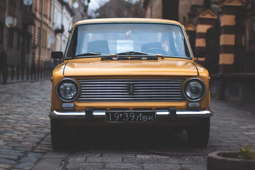
Check out what happens to the Histogram of the image. I’ve included the Before in the image below.

Step 4
Move the Vibrance slider to the right, about +20
Move the Saturation slider to the left, about -20

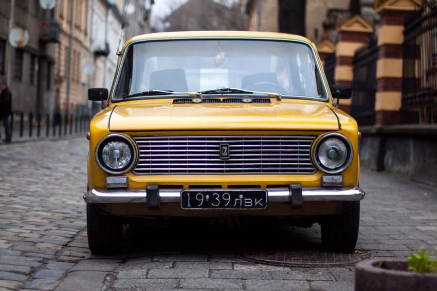
Now we have the final resulting image that is colour graded like in the movies and looks like a screenshot out of the cinema. So now you can create your own matte cinematic look following these steps.
Conclusion
I hope you found these steps easy to follow and replicate. Please let me know in the comments below what you thought about this post. Was it helpful or was it now?
I certainly enjoyed creating this step by step tutorial showing you how to colour grade and create this matte cinematic look in an image.